

Table of contents


No headings in the article.
Hey there, today we're off to make a traffic light, yeah same traffic light that fined you for trespassing the red light.
But this is going to be CSS only, because why not take an hour to do everything in CSS only that you can do using javascript in minutes.
CSS (suffering) is fun
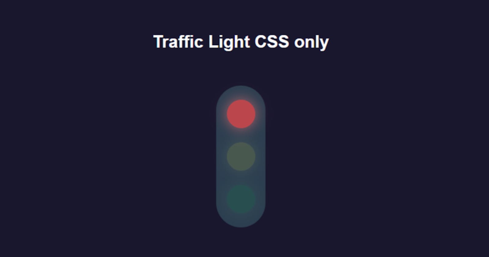
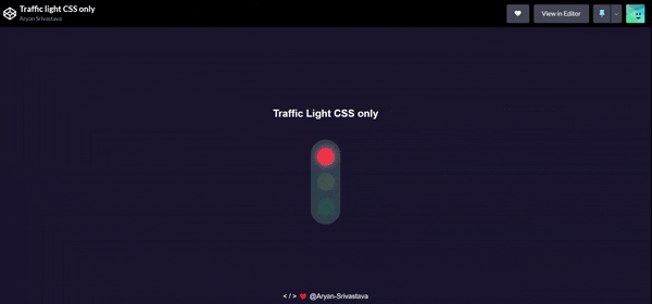
Preview of what we're going to make it's really just a traffic light -
HTML
<h2 class="heading">Traffic Light CSS only</h2>
<div class="post">
  <div class="circle red" color="red"></div>
  <div class="circle yellow" color="yellow"></div>
  <div class="circle green" color="green"></div>
</div>
Basic CSS Styling
- Now add some basic styling.
- center every thing to middle of the page
*,
::before,
::after {
  margin: 0;
  padding: 0;
  box-sizing: border-box;
}

body {
  background-color: #19172e;
  display: flex;
  justify-content: center;
  flex-direction: column;
  align-items: center;
  height: 100vh;
}

.heading {
  margin-bottom: 3rem; // give margin to the heading
  color: white;
}
Design the post
.post {
  background-color: #2c3e50;
  border-radius: 50px;
  height: 200px;
  width: 70px;
  display: flex;
  flex-direction: column;
  justify-content: space-evenly;
  align-items: center;
}

.circle {
  background-color: #1f1c39a2;
  border-radius: 50%;
  height: 40px;
  width: 40px;
}
Now this is where the interesting part begin-
Animating the Lights
/* animate traffic light */

.red {
  background-color: rgb(255, 74, 74);
  box-shadow: 0 0 20px rgb(255, 123, 123);
  animation: redLight 4s infinite;
}

.yellow {
  background-color: rgb(255, 255, 74);
  box-shadow: 0 0 20px rgb(255, 255, 129);
  animation: yellowLight 4s infinite;
}

.green {
  background-color: rgb(8, 215, 74);
  box-shadow: 0 0 20px rgb(132, 255, 132);
  animation: greenLight 4s infinite;
}

@keyframes redLight {
  0% { opacity: 1; }
  10% { opacity: 1; }
  20% { opacity: 0.1; }
  40% { opacity: 0.1; }
  60% { opacity: 0.1; }
  80% { opacity: 0.1; }
  100% { opacity: 1; }
}

@keyframes yellowLight {
  0% { opacity: 0.1; }
  20% { opacity: 0.1; }
  40% { opacity: 1; }
  50% { opacity: 0.1; }
  60% { opacity: 0.1; }
  80% { opacity: 1; }
  90% { opacity: 0.1; }
  100% { opacity: 0.1; }
}

@keyframes greenLight {
  0% {opacity: 0.1; }
  40% { opacity: 0.1; }
  50% { opacity: 1; }
  60% { opacity: 1; }
  70% { opacity: 0.1; }
  80% { opacity: 0.1; }
  100% { opacity: 0.1; }
}
If you liked it please do consider a follow, like and comment down below. Codepen Link